Mobile-First Indexing :: Responsive Web Design for epages base 6 Shops

Intoduction
With 1.7 trillion mobile devics in the beginning of 2014,the number exceeded the PC for the first time. And with 51 % in June 2015, also the time for online surfing.
Currently there is no way to adjust the presentation of your online shop on tablets on ePages online shops. Our service Web Responsive Design optimizes the presentation and use of ePages online shops on tablet devices.
Example
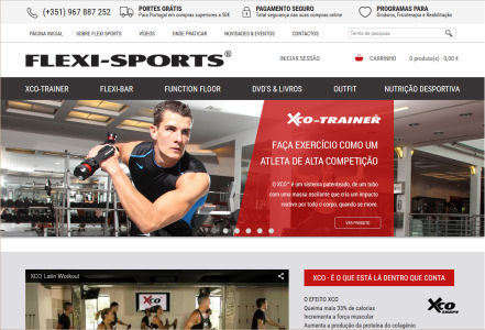
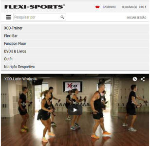
Typically when Responsive Design is applied, various screen elements are changed as soon as the online store or the website will be displayed on a screen with the standard tablet resolution.
As shown in this example, the headers height will be reduced, as well as the size of the store logo. The links in the header will be replaced with icons.
The menu in the navigation bar below the header is replaced with one single button which opens the main menu by pressing it.
Content, including images, are resized to 100 % of the existing screen width .
 |  |
| Tablet Version | PC Version |
 |  |
| Tablet Version with opened main menu | Inner page with responsive desgin |
Your Advantages
Adapting your ePages online shops for Tablet Computer optimizes the presentation and use of shop and website content and functions. Additionally, increases the number of visitors and revenues.
The adapted tablet version preserves the original design concept of the PC version. So, your customers have the same Look & Feel and corporate branding on the tablet version
Changes to your ePages online shop
And these changes are made on your ePages shop:
- Resizing of the company logo
- Sizing and adapting content header
- Replace the main menu by a menu button with list of all major categories
- Adjusting the slider on the home page (just Customized Sliders)
- Adapting the text content
- Adapting the category lists
- Adjustment of product lists
- Adjustment of product pages
- Sizes, and content adaptation of the skirting-board
Changes on inserted contents are optional.
What benefits have you ne your customers?
- Your Online Store appears completely on Tablets
- The menus are easy to operate
- Texts and contents are legible
- Easy to use all functions
- Your customers will experience a positive experience and like to buy into your shop.
How do I determine if my ePages online shop is adapted to Tablets Devices?
The easiest way is of course to try your epages shop on a tablet device. If possible, use a mini-tablet with an 8-inch screen. If you have no tablet device available, open your ePages online shop in your PC browser and reduce the width of the browser window.
If elements are cut, such as menus and page content, under a certain screen width and if the shop does not fit itself to the changing width of the browser window, you should consider an adjustment to consider and make use of our service offering.
|
Responsive Web Design ensures optimal presentation of your epages online store on Tablet and Smartphone devices. |
from
495.00 € * |
|
|
|


